In my project I wanted to rebrand the Helsinki Tram Network, the theoretical problem of this project is that Helsinki’s Tram Network is provided by a greater metro system that includes Buses, Trams, Trains and Ferries. I did not want to apply my whole rebranding to the metro sytem because of how much research and practical outcomes that could be produced from this.
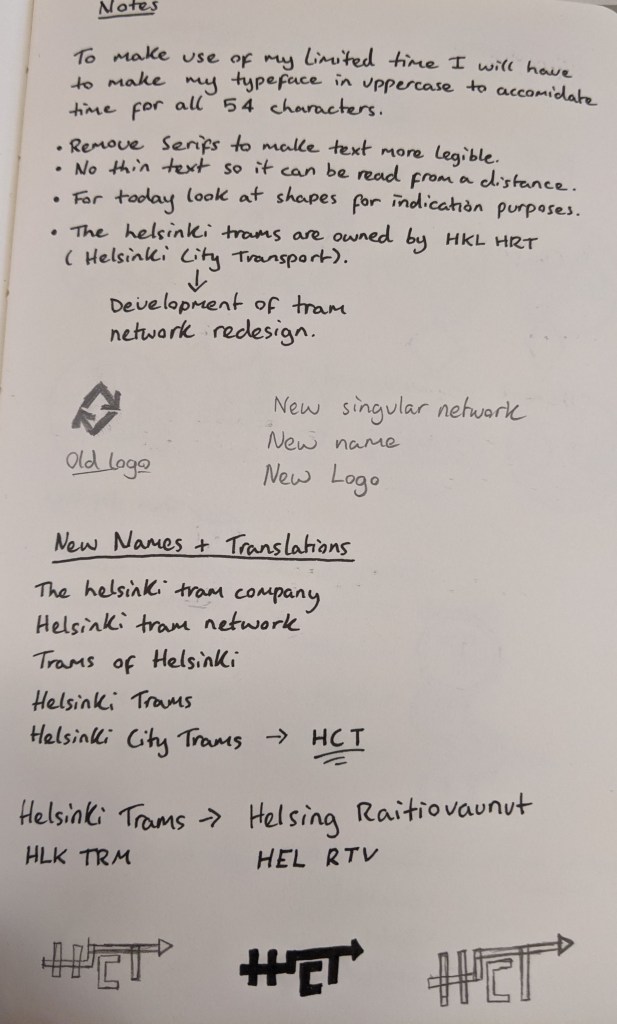
Below is the old logo for Helsinki’s greater metro network ‘Helsinki City Transport’. During this project I did not realise my fictional Tram Network (Helsinki City Trams) shares the same acronym as this already established company. The only reason I wanted to create my own network instead of redesigning the original company is because I wanted to keep it exclusive to Trams, and I wanted to build a new concept from the beginning instead of relying more heavily on the old networks designs.

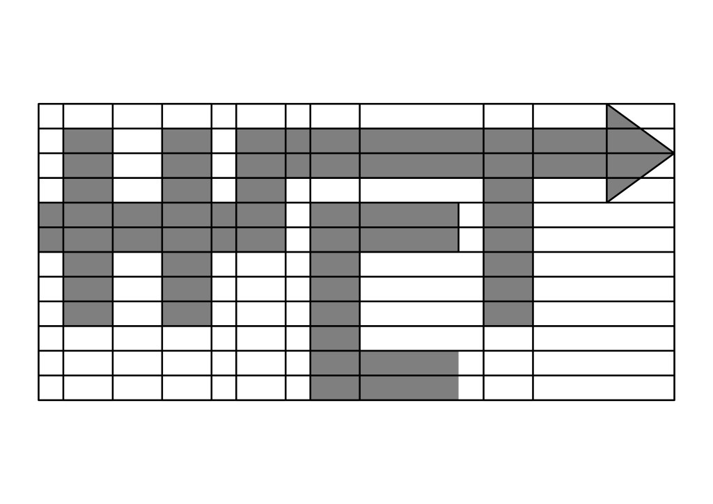
This is my final logo (without colour) I made the font blocky and grid-like to represent the order of a transit system. I put the curve and the arrow through the T because I wanted the logo to show travel, as if the arrow were moving around a building.

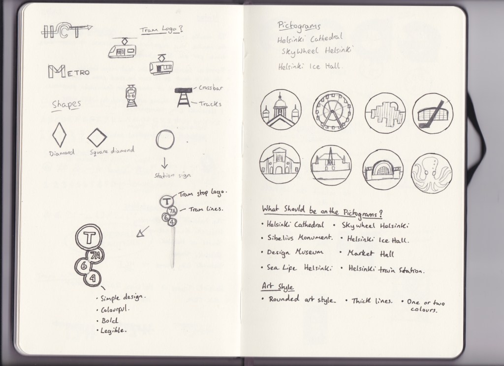
Below is my initial developement sketches and notes on how I wanted my logo to look like. I developed this logo before I developed the overall round pearl-like theme to my typeface, so it ended up more industrial and blocky. I feel like this is fine because it fit into my grid-like theme that I used to develop most of my practical outcomes.
I constructed my logo the same way I wanted to develop my font, I initially starded with one square as the thickness of the type I then built the square into a full set of letters. I used squares that were 1/4 the size of the original to use as spacing between the C and the other letters.


In conclusion I think my logo is very strong and distinct for a Transit logo. I developed this logo because it would influence the rest of my future designs and would be used as a stamp on future designs to show the company association.

